
Having spent an afternoon examining and contemplating Apple’s Liquid Glass design language on my iPhone, I'm not entirely opposed to it. However, it seems like it could benefit from a bit more refinement.
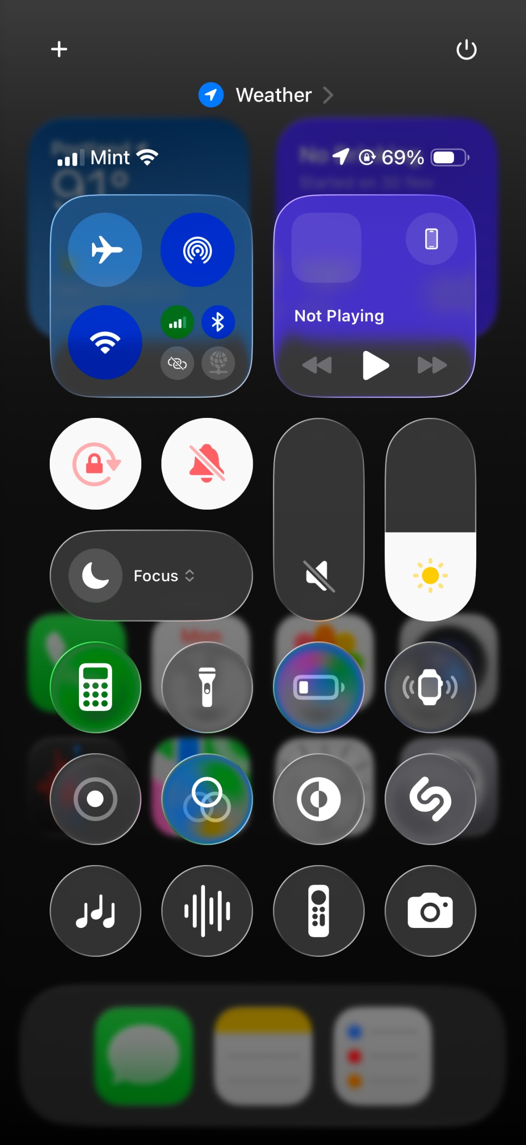
Apple unveiled Liquid Glass during WWDC 2025, and it’s set to feature across all its devices. The most striking aspect of this update is the revamped app icons, tab bars, and even the text magnifier that appears when you hover over words—everything has a unique, liquid-glass effect.
The concept is intriguingly simple: by layering this “glass” over elements like your lockscreen wallpaper or text, it achieves a translucent look that allows a glimpse of what lies beneath. It’s a fitting approach, and the first rollout seen in the iOS 26 developer beta is filled with Apple's iconic design details.
However, the initial experience can be quite a shock.

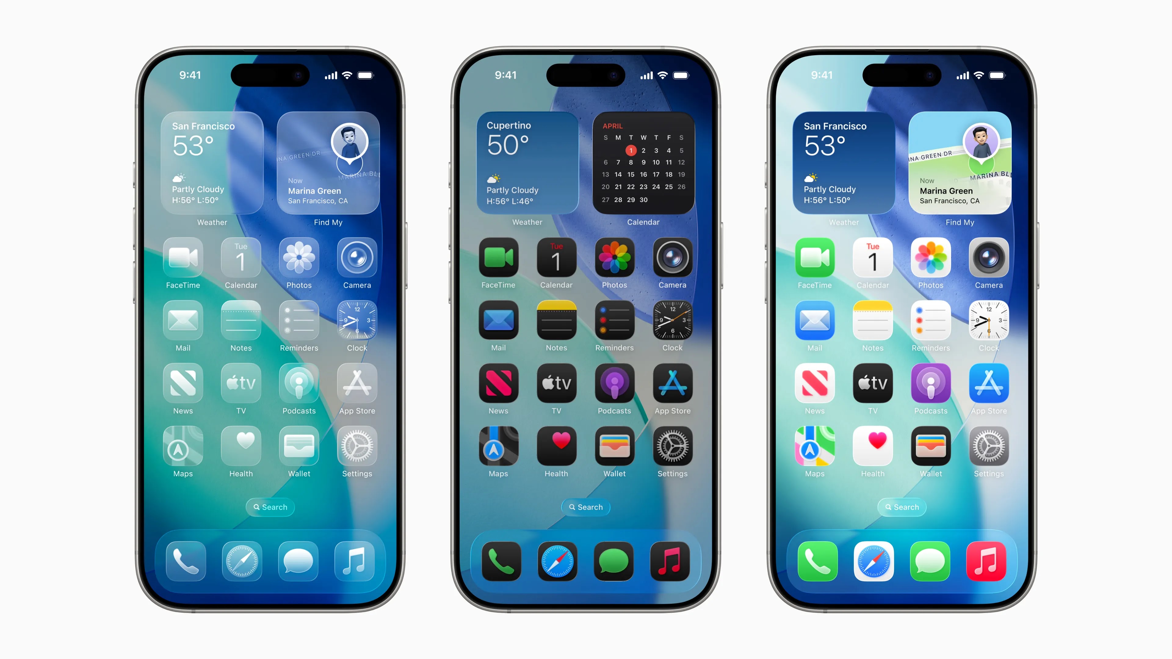
Even with my purposely grayscale homescreen, I hope you can notice that the differences stand out right away. Everything has a clear and glossy finish.
Here’s my homescreen with the colors reintroduced if you prefer a different perspective. While many icons will look familiar, they all have a more vibrant and playful quality.

Subscribe by Email
Follow Updates Articles from This Blog via Email
No Comments